LUMINA MUSEUM
APP DESIGN

UX Design Case Study –Student Project
Duration: 4 months

A user-friendly app for an art museum that engages the visitors with the museum content as well as provides a smooth process for ticket purchase.
Problem Statement

Museum visitors often face difficulties in discovering current and upcoming exhibitions and events, accessing essential museum information, and scheduling their visits efficiently. The lack of a streamlined, user-friendly digital platform results in lower engagement and attendance, as well as a suboptimal visitor experience.

Goals

Create a user-friendly app and responsive website that centralize exhibition and event information, improve accessibility to essential museum details, and simplify the scheduling and booking process to enhance overall visitor engagement and satisfaction.

Design Process

User Research
User Persona
User Journey

User flow
Information architecture

Wireframe
Lo-fi design
Hi-fi design
Prototype

Feedback
Conclusion
Next Steps

User Research

I conducted basic user research through interviews with potential users, such as students, art lovers, and occasional museum-goers. I assumed people would want features like accounts and sharing options, but I learned they preferred a simple app that’s easy to navigate without signing in. Many users wanted quick access to museum highlights, the ability to book tickets easily, and an interactive feature like scanning artwork. This research helped me focus on creating a user-friendly app that’s all about exploring and enjoying the museum experience.

Illustration by  Vincent Le Moign
User Pain Points

Operational information such as hours of operation, ticket prices, location, facilities, and services, should be easily accessible.

Users find it easy when they can book tickets and schedule visits without creating an account.
Users want to see that the museum content is interactive and engaging during their visit.
User Journey Map

Display the Exhibition Details

Booking a Ticket

Pre-Visit Check

During Visit

Task List

1.Look up the museums and exhibitions in her city.
2.Determınes the museum and opens the app.


1. Search about the Exhibition details –time, place, or videos,any information.


1.Open the booking page
2.Select time and day.
3.Purchase the ticket.


1.Check museum hours and location of the museum.
2.Check the tickets are confirmed.

1.Explore the museum and the exhibition
2.Check the information for the museum and exhibitions.
3.Use the maps, audio guides etc.

Emotions

Curious, excited

Optimistic, excited, engaged

Hopeful, a bit stressed

Organized

Interested, engaged, satisfied

Improvement Opportunities

Highlight the current exhibitions for easy access.

Include rich multimedia content such as videos and audioguides for deeper engagement.

Simplify the booking process with clear navigation and multiple payment options.

Provide real-time updates on booking status and visit reminders.

IIntegrate indoor navigation, interactive guides and scanning feature for a seamless experience.

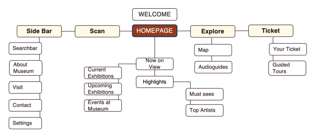
Information Architecture

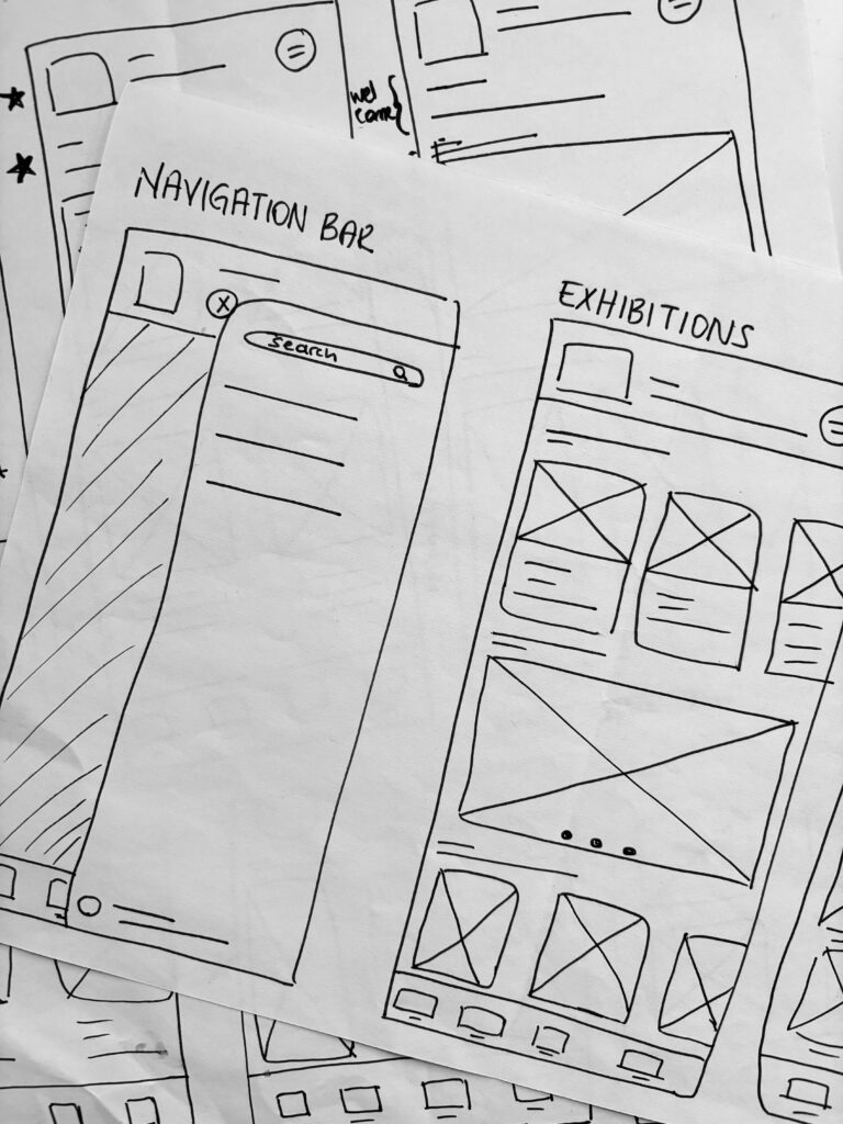
Paper Wireframes

Based on the core features identified through user research, I created the initial wireframes for each screen as hand-drawn sketches to map out the app’s structure and functionality.

Low Fidelity Wireframes

After putting my ideas on paper, I decided the first draft look of the application among several iterations. I transformed these hand-drawn ideas into digital wireframes in Figma. Using the user flow diagram and wireframes, I developed a low-fidelity prototype to test functionality and ensure the design was accessible and user-friendly before finalizing the design.

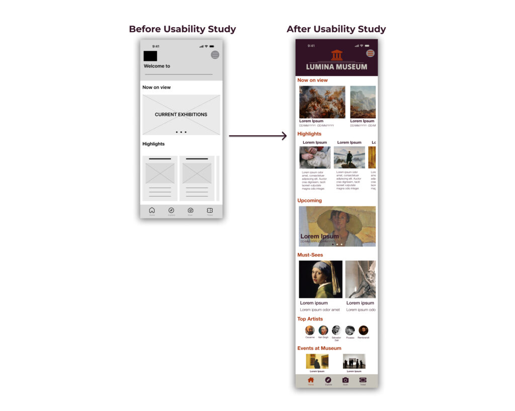
Usability Study: Findings


I conducted two usability studies after I had the lo-fi prototype and a mockup. Both studies were moderated and 5 people attended each. After the usability study, I focused on the user interface and interactions to create a high fidelity prototype.

Round 1 Findings

* Users want to reach the current and upcoming exhibitions more quickly.
* Scanning function was confusing, information about scanned artwork and audioguides should be more accessible.
* Home screen design is not easy to navigate, it should be more simple and accessible.

Round 2 Findings

* Users want to access the museum operation hours easily, especially after they book the ticket.


Review


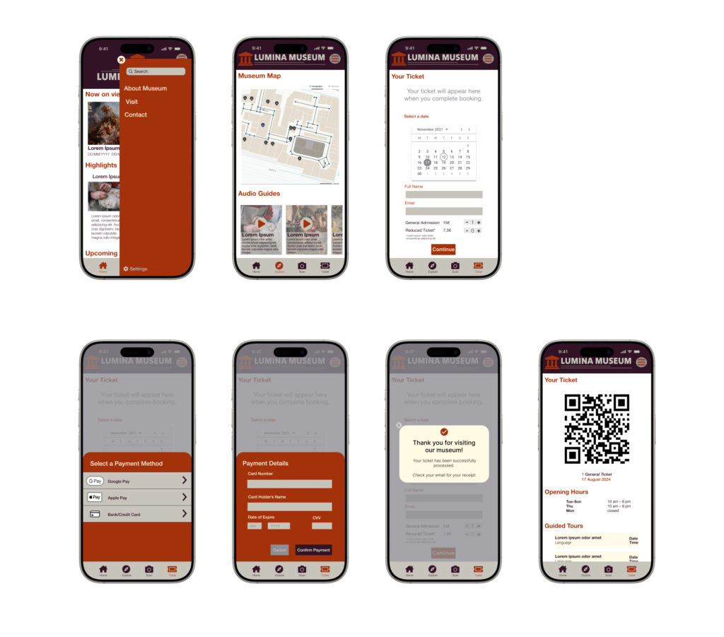
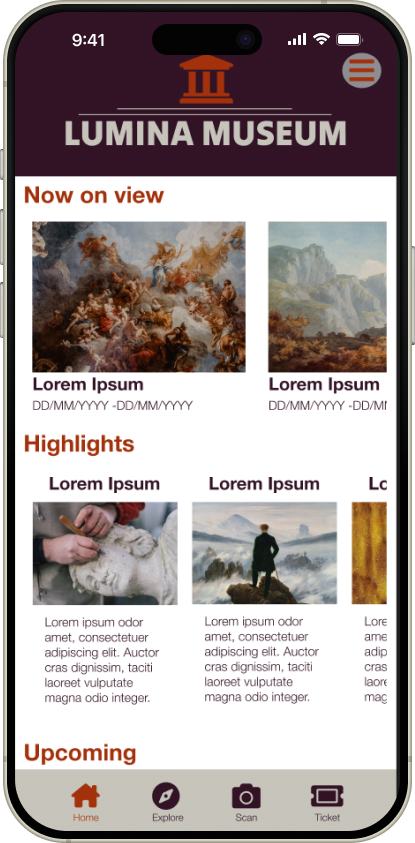
After reviewing the usability study results, I applied the new insights into the high fidelity design. Considering the results, I mainly rearranged the information on the homescreen, combining ‘now on view’, ‘highlights’ and ‘upcoming’ information details into one screen to make it more simple and accessible design.

High Fidelity Prototype

Home Screen

After finalizing the low-fidelity wireframes, I focused on creating the final designs with a goal of making them visually engaging and easy to navigate. The main color palette I chose blending warm, earthy tones with a soft, elegant contrast to create a welcoming and sophisticated atmosphere for users.

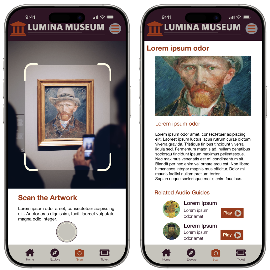
Scan the Artwork

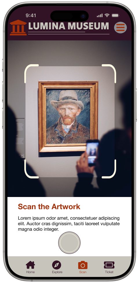
This screens allow users to photograph an artwork using the app’s built-in camera functionality, providing an engaging and interactive way to explore exhibits. Once scanned, detailed information about the artwork, including its history and related audio guides, is displayed, enriching the user experience with accessible and immersive content.

Other Screens

Style Guide

Color Palette

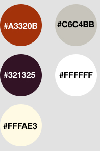
I selected a color palette that balances with the museum’s branding colors, that is warm, deep, and clear. I used the main color of museum logo, rust red as the accent color, to emphasize and engage the brand colors. To make the app more accessible and the content more readible, I used white as the primary background color to create a clean and neutral canvas. Deep plum was applied as the secondary color to provide contrast and structure, particularly in navigation and key UI elements.

Typography

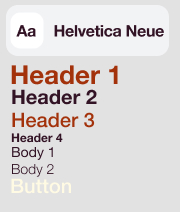
I combined the color palette with a clean and modern typography system to enhance readability and align with the museum’s sophisticated brand. Helvetica Neue as the primary typeface, enhances an elegant, user-friendly and minimalist design.

Icons and Buttons

I designed the icons with a minimalist and user-friendly style, ensuring clear visual communication and easy recognition for seamless navigation. For a simplistic design, I used Font Awesome as the source.

Key Takeaways


Throughout the desig process, as UX designer, I learned the importance of balancing functionality and aesthetics to create a seamless user experience that meets both user needs and brand identity. This project emphasized the value of user-centered design, iterative feedback, and attention to detail in building an intuitive and engaging product. User feedback is always a key to understand their needs in each step of the design process.

Illustration by Vincent Le Moign

Thank you for your interest!

If you’d like to connect or discuss opportunities, I would be glad to hear from you!

You cannot copy content of this page

WordPress Cookie Notice by Real Cookie Banner