BookBridge App Design

UX Design Case Study –Student Project
Duration: 4 months

A platform that connects people who want to donate or exchange books with those seeking them, creating a virtual and physical network of community-driven book sharing.

Problem Statement

People struggle to find a reliable way of donating or receiving books, and drop-off locations need an easier way of processing donations. Existing solutions are typically disorganized or inaccessible.

Goals

Our app creates a flawless book donation network, connecting donors, recipients, and drop-off locations to make book sharing easy, organized, and impactful.

Design Process

User Research
User Persona
User Journey

User flow
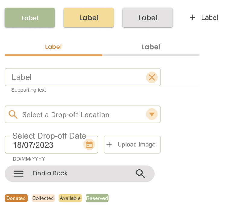
Information architecture
Paper Wireframes & Storyboard

Wireframe
Lo-fi design
Hi-fi design
Prototype

Feedback
Conclusion
Next Steps

User Research

I conducted user research to understand the needs of book donors, recipients, and drop-off location owners. Through persona development and journey mapping, I identified key pain points and designed solutions that make book donation smooth and accessible. Insights from research shaped the My Books feature, simplified location management, and improved the overall user experience.

Illustration by Vincent Le Moign

User Personas

Ahmed: the Donor

Age: 45
Degree: BSc in Computer Science
Marital Status: Married, with two kids. (11 and 8)
Occupation: IT consultant
Location: Berlin, Germany.

Ahmet is a father of two young children with a large book collection who needs a reliable and convenient way to donate his family’s unused books because he wants to ensure his books go to trusted recipients and contribute to both the community and the environment.

Pain Points:

  • With work and family, he doesn’t have much time to research donation options.
  • He is uncertain whether the books will reach the target people or if they will be thrown away.


Photo by Gabriella Clare Marino on Unsplash

Luke: the Recipient

Age: 20
Degree: BA in Literature
Marital Status: Single, living in a shared apartment with roommates
Occupation: Student
Location: Berlin, Germany

Luke is a literature student who loves reading and desires to expand his knowledge. However, as a student, he struggles with the cost of purchasing books. He values sustainability and he looks for ways to access more books without the financial burden. He wants to find community-driven initiatives that make literature more accessible.

Pain Points:

  • It is difficult for him to maintain an affordable reading habit because of high cost of new books.
  • Limited access to quality secondhand books that are both affordable and in good condition.
  • He struggles to find easy-to-use platforms to request or find free books in his area.


Photo by Ian Dooley on Unsplash

Maria: the Location Owner

Age: 38
Degree: BSc in Management
Marital Status: Married with one child (age 4)
Occupation: Cafe Owner
Location: Berlin, Germany

Maria runs a small cafe in Berlin that has become a popular gathering spot for locals. She has a strong sense of community and is always looking for ways to support local initiatives. One of her goals is to make her cafe a hub for social good.

Pain Points:

  • Limited space in her cafe for storing donated books, especially if the volume is high.
  • She needs a simple system to track what books are coming in and where they should go.
  • Some patrons may donate books outside of her regular hours, and she needs a way to manage that without disrupting cafe operations.

Photo by Microsoft Edge on Unsplash

User Journey Map

Storyboard & Paper Wireframes

I created storyboards to visualize user interactions and explore different scenarios for book donation and retrieval. Using quick paper wireframes, I iterated on layout ideas, ensuring an intuitive and user-friendly experience before moving into digital prototyping.

Low Fidelity Wireframes

I translated initial sketches into low-fidelity wireframes, focusing on usability and easy navigation. Two user profiles exist: Reader, who can donate and accept books, and Location Owner, who manages drop-off sites. I focused on easy onboarding, intuitive My Books section for book tracking, and clean location dashboard. These wireframes were a foundation to test and iterate the user flow prior to high-fidelity design creation.

Review


The transition from low-fidelity to high-fidelity wireframes enhanced usability, visual hierarchy, and interaction design. While the low-fi version focused on structure and user flow, the high-fi design refined spacing, typography, and accessibility. The two-profile system (Reader and Location Owner) remained, but with clearer distinctions and a more guided experience. High-fi wireframes also introduced interactive elements, improved contrast, and a polished pastel color palette, making the app more engaging and user-friendly.

High Fidelity Prototype

The high-fidelity prototype brings the app to life with a refined pastel color palette, intuitive navigation, and interactive elements that enhance the user experience. The prototype includes smooth transitions, clear call-to-action buttons, and accessible design choices to ensure usability for both Readers and Location Owners. A short GIF demonstrates the key user flows, showcasing how users can donate, reserve books, and manage drop-off locations seamlessly.

Onboarding Screens

The onboarding experience provides a smooth introduction to the app, guiding users through its purpose and features. The profile selection screen allows users to choose between a Reader (who donates and receives books) or a Location Owner (who manages drop-off points). Simple illustrations, clear typography, and friendly microcopy make the process intuitive. The design ensures a welcoming first impression, helping users quickly understand how they can participate in the book-sharing network.

Other Screens

Style Guide

Color Palette

A soft pastel palette has been created for a warm and inviting feel. Peach and pastel green set a calming tone, while soft yellow highlights key elements. Muted orange draws attention to actions. This balance ensures readability, accessibility, and user experience.

Icons and Buttons

I designed the icons with a minimalist and user-friendly style, ensuring clear visual communication and easy recognition for navigation. For a simplistic design, I used Material Design as the source.

Typography

The app features Poppins for a modern and friendly look, paired with Arial for readability and accessibility. Poppins adds a touch of warmth to headings and key elements, while Arial ensures clarity in body text. This combination keeps the interface clean, approachable, and easy to navigate.

Key Takeaways


This project is focused on developing an intuitive application that simplifies book donation. As UX Designer, I have created this project from idea to prototype. I have developed two different user roles, Readers and Location Owners, each with tailored features for donating and managing donations. I have given priority to implying soft pastel colors and clean typography, to create a welcoming and minimalist user environment. Easy navigation, smooth onboarding, and interactive elements result in an immerse user experience. Lastly, the project promotes community involvement and sustainability by giving books a second life and contributing to a circular economy.


Illustration by Vincent Le Moign

Thank you for your interest!

If you’d like to connect or discuss opportunities, I would be glad to hear from you!

You cannot copy content of this page

WordPress Cookie Notice by Real Cookie Banner